
COMMUNITY HEALTH ASSESSMENT
Pick your community. See its health needs, ranked and sourced.
An analytical platform for community health assessment. Anchor a project on a hospital, a county, or a reservation, and get a benchmarked health profile, a tract-level disparity view, and a transparent ranking of candidate needs, all from public data and all in one place.
- 432curated health and social factors
- 44domains
- 3ways to start: hospital, county, or reservation
- 3benchmarks: county, state, and nation
What it does
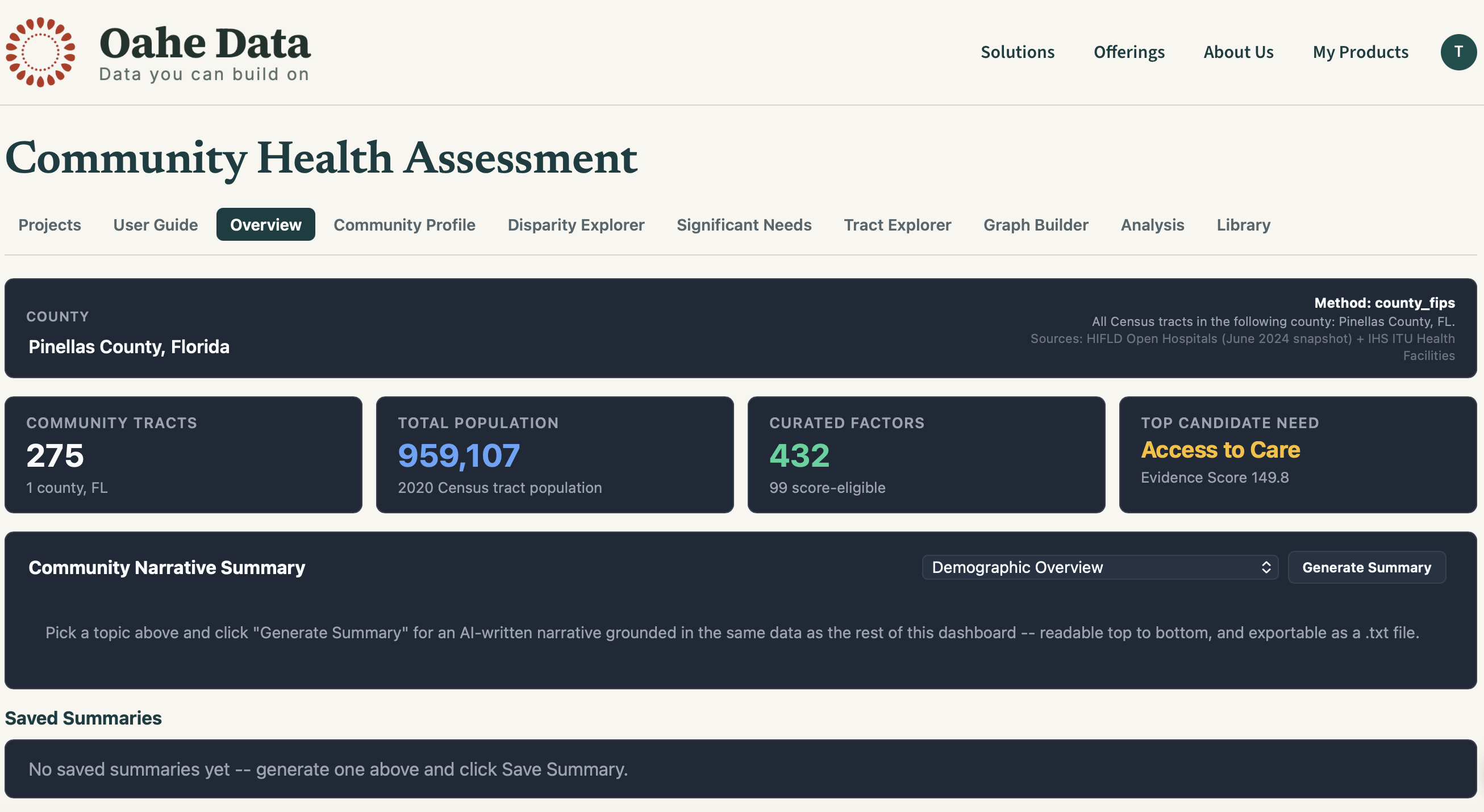
Define your community, your way
Start a project from a hospital, one or more counties, or one or more reservations. The tool works out the states and census tracts for you, then builds the project in the background. Reopen it instantly any time.
- Hospital, county, or reservation anchors
- Reservation projects work without choosing a hospital, and combine multiple tribes if you need to
- Adjust the included counties, reservations, or radius live, without rebuilding
- Switch between census tract and town or city views
Benchmark against county, state, and nation
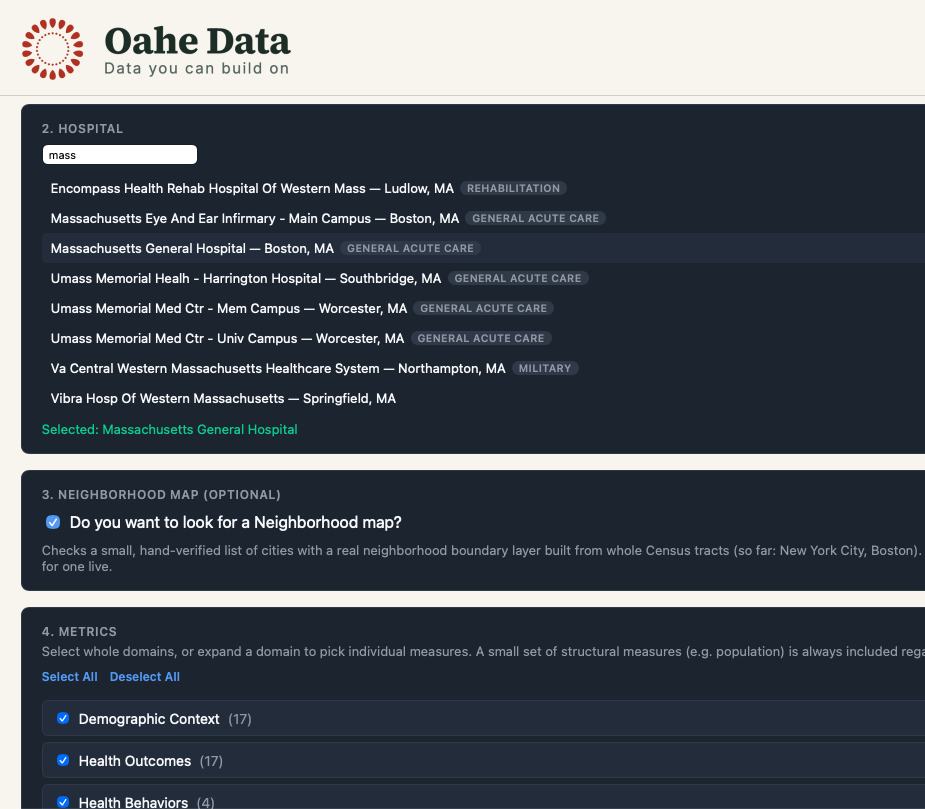
See every curated health and social factor for your community next to county, state, and national values, grouped by domain, with trend arrows and a Top 20 list of the highest-importance measures.
- 432 curated factors across 44 domains
- Trend line on every factor
- Population-weighted values, never simple averages of tract percentages
Find where need is concentrated
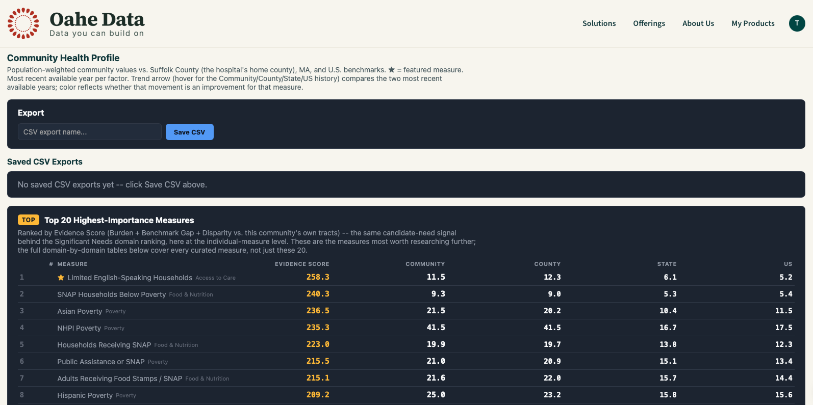
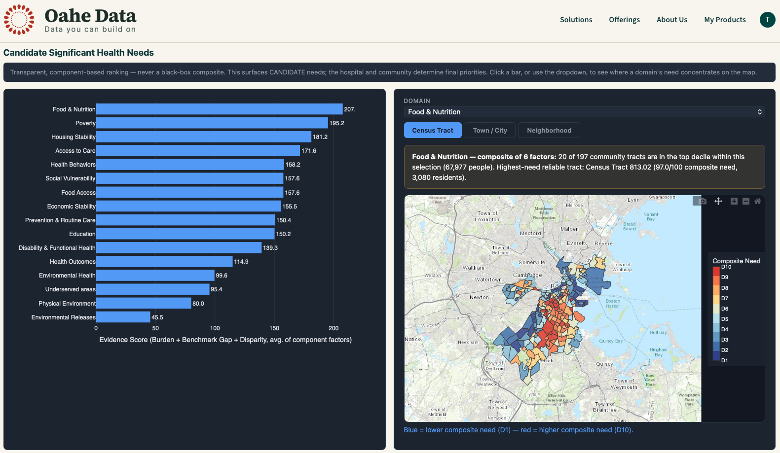
The Disparity Explorer maps any factor tract by tract, with multi-year trends, counts of high-need tracts, the population affected, and the highest-need reliable tract. Reservation projects add a side-by-side reservations map.
- Tract-level choropleth for any factor
- Population affected, not just percentages
- Small, unstable tracts are kept off the headline picks
Rank needs with a transparent score
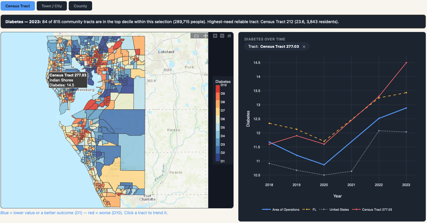
Domain-level candidate needs are ranked by an Evidence Score you can inspect. Every component factor is shown, so nothing is a black box.
- Evidence Score combines Burden, Benchmark Gap, and Disparity
- Every need card shows the factors behind it
- Results are framed as candidate findings for community review
Compare tracts and build your own charts
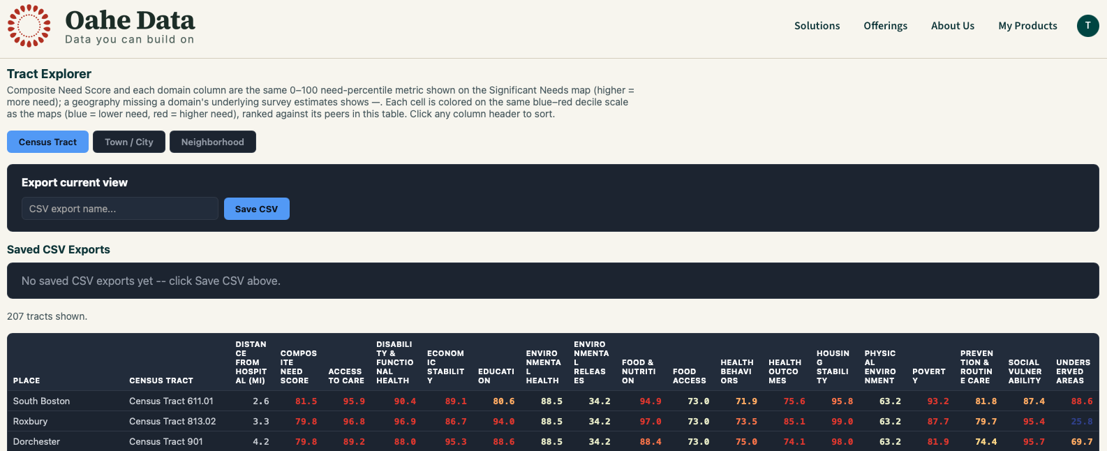
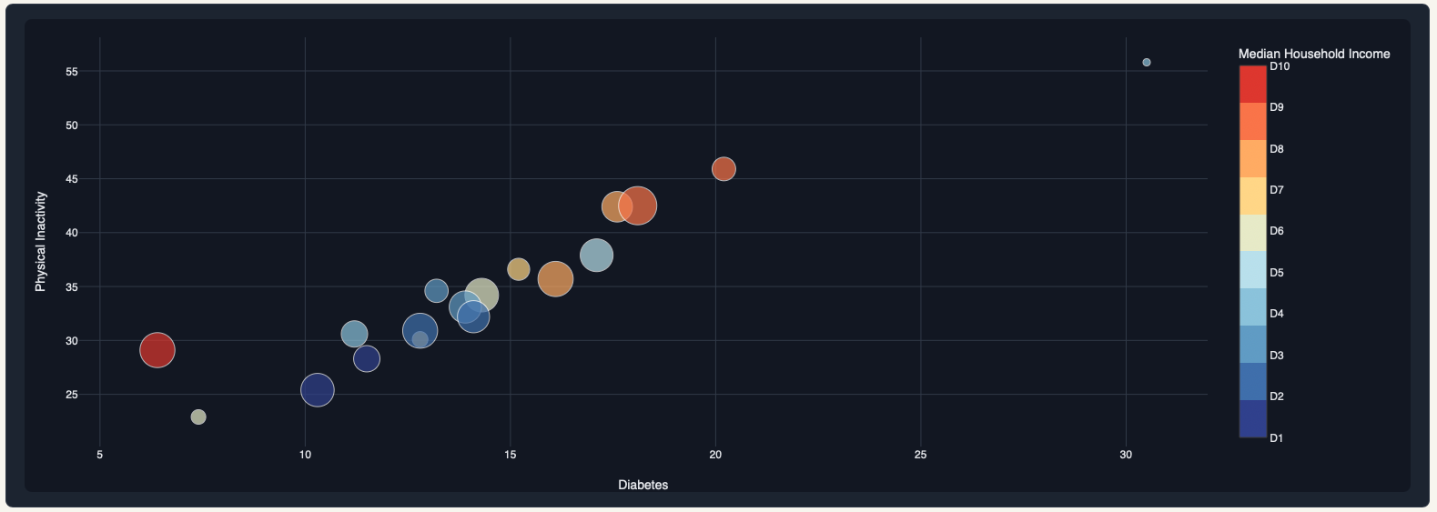
Sort every tract by a composite need score, roll results up to towns or neighborhoods, and compare counties or reservations side by side. Then build and save custom charts against any metric.
- Sortable tract table with a color scale on every value
- Neighborhood, reservation, and county comparison views
- Line, column, bar, scatter, dumbbell, and box and whisker charts
Write it up with AI grounded in your data
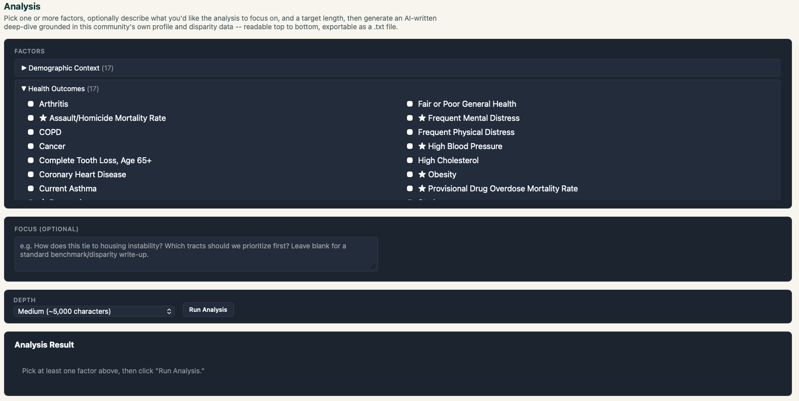
Pick the factors you care about and ask a focused question, such as which tracts to prioritize first. The AI drafts a write-up grounded in your community's own profile and disparity data. Ask follow-up questions in the built-in assistant, which says which source it used for each answer.
- Narrative summaries by topic, exportable as text
- Save and reopen analyses, summaries, charts, and maps
- Assistant answers from your dashboard data first, with source labels
Build a report
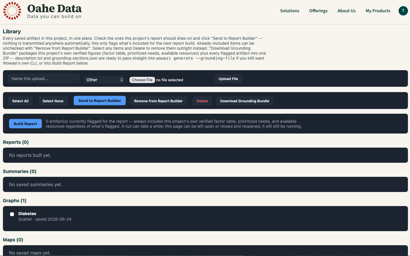
Collect saved analyses, charts, and your own documents in the Library, then run Build Report. It drafts chapter by chapter in the background and delivers DOCX chapters and a compiled HTML report you can download.
- Add your own surveys, letters, and meeting notes as reference files
- Download a grounding bundle of verified figures for use elsewhere
- Runs as a tracked background job
New to the tool? Read the user guide.